What’s the Problem?
A significant disparity surfaced between Figma inputs (such as Text Inputs, Textareas, Selects, Labeled Controls, etc.) and the API during the rebuild of our documentation site. Despite my previous reconciliation efforts between the API and Figma elements, there was a clear call for structural modifications to address these inconsistencies and ensure accurate documentation and hand-off from designers to engineers.
Goal
The central aim of the project was to synchronize all inputs in the Figma web library with the API structure, smoothing out the transfer process between designers and engineers in Zillow’s Design org (ZxD) and enhancing our documentation accuracy. It was also an opportunity to improve the usability of these components for designers, a move I thought would help their productivity levels.
Work done
I owned the detailed transformation of all 22 Figma input components. This rigorous process entailed:
- Rebuilding many input components in Figma from scratch.
- Working closely with engineers to gain an in-depth understanding of how inputs were functioning in order to ensure their accurate representation in Figma.
- Enhancing component variant functionality for easy input swaps.
- Leveraging new Figma functionalities, such as Nested Instances, which were integral to component reconstruction.
- Conducting user research with ZxD designers to validate the ease of integration and ensure that the new structure did not interfere with their established workflows.
- Developing comprehensive training materials to clarify the changes and guide designers on adopting the new method for manipulating input components.
Outcome
In my role, I carefully redesigned inputs – one of our most accessed library components in Figma. This redesign, which was warmly received by ZxD designers, expedited their design processes and substantially increased their productivity. In an effort to simplify the design experience, I successfully cut down the number of components from 22 to 15. In addition, I made it possible for designers to easily browse through diverse component variations without the need to continuously access Figma’s asset panel, thus streamlining the entire design workflow.
The effort achieved an impressive 98% alignment between Figma and the API. Despite aiming for a full 100% parity, some Figma limitations made it hard to accomplish. This project, without a doubt, showcased the undeniable value and efficiency that stems from aligning design systems closely with the API, and the importance of embracing new design tool features.
Where it all started
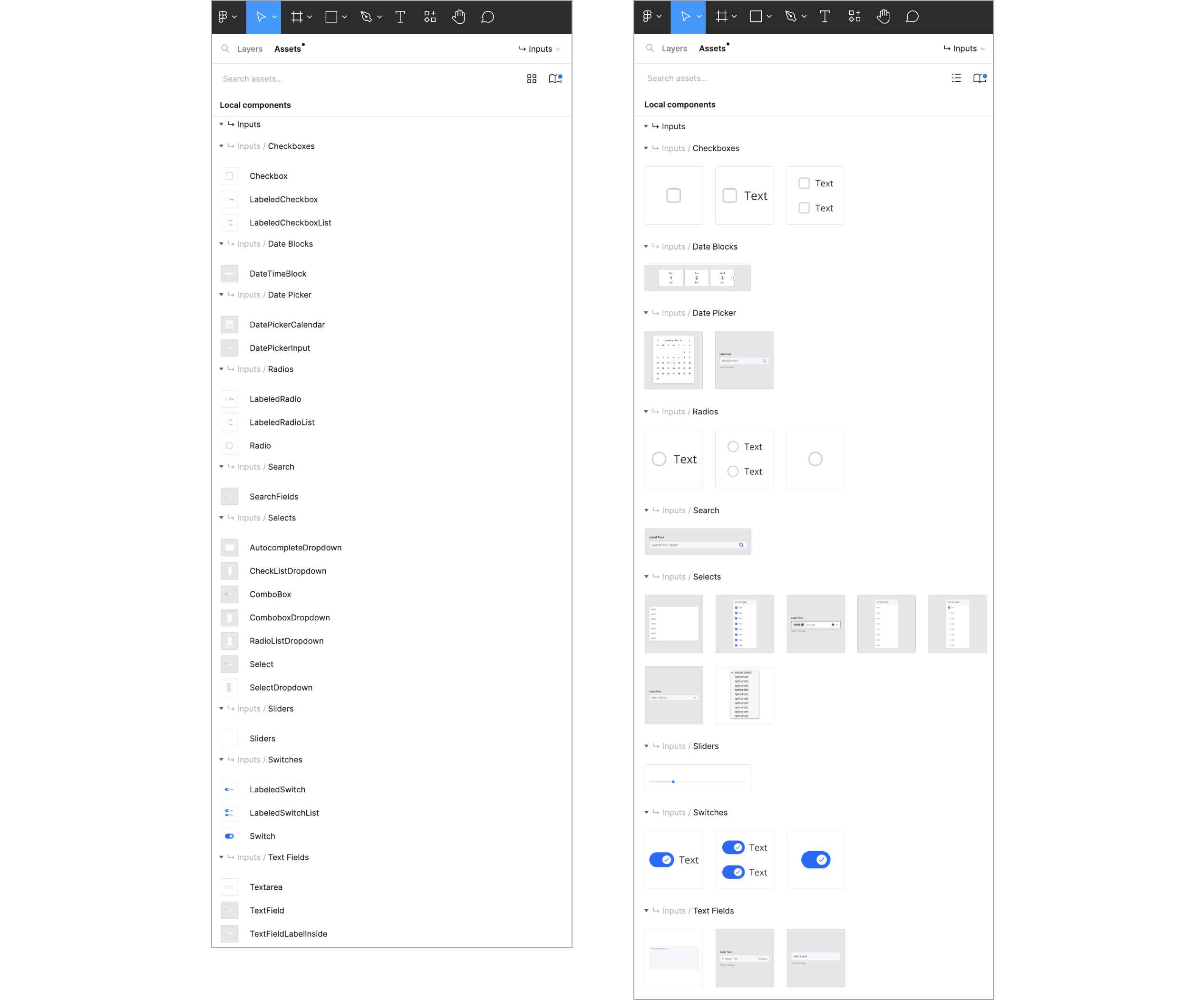
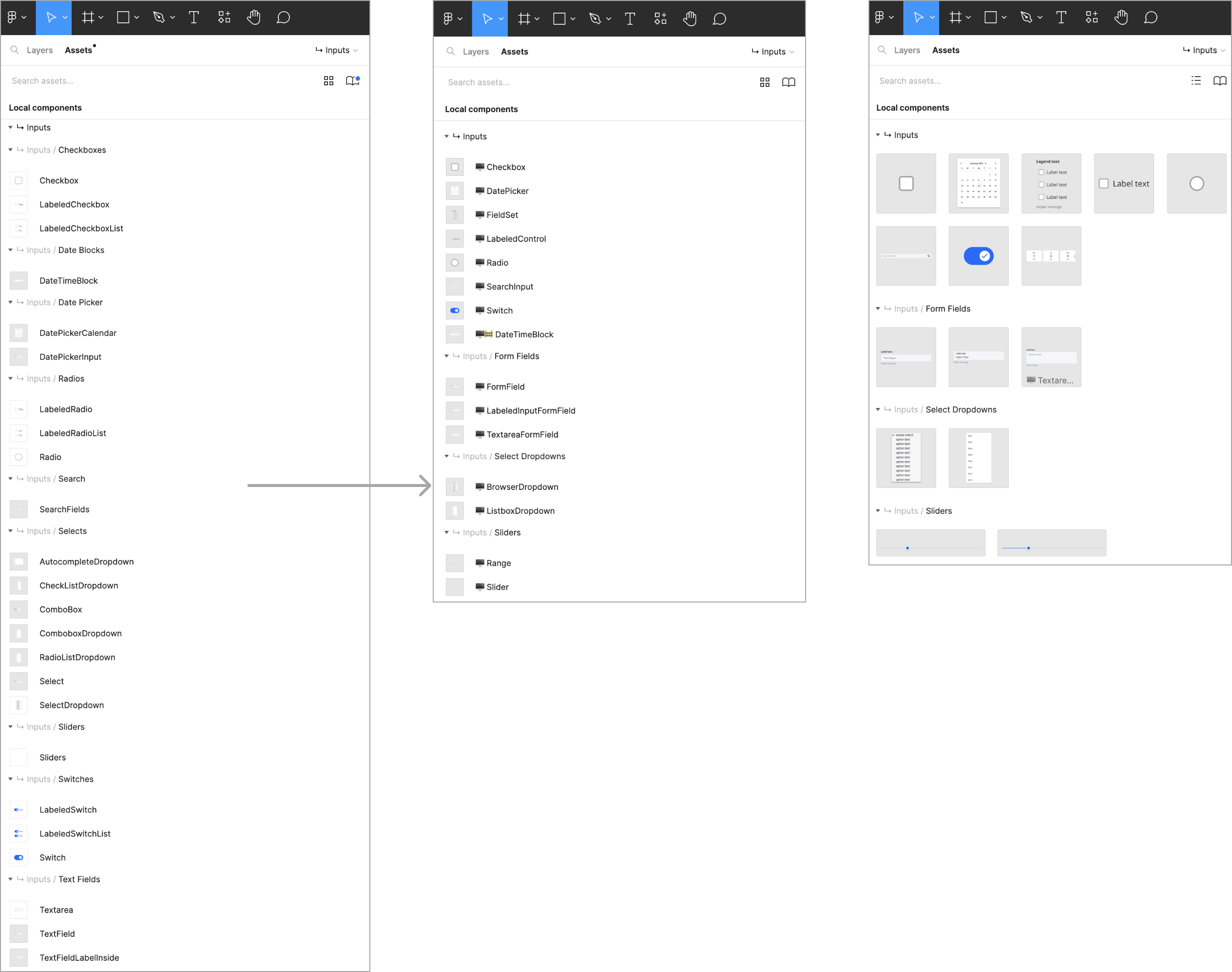
This initiative took root during our efforts to launch a new documentation site. During this phase, it became clear that the Figma inputs required a thoughtful revamp to align more closely with the API, prompting a critical design transformation. Proactively, I embarked on a comprehensive investigation to assess potential restructuring strategies for a range of components, aiming to attain parity with the API. The following image provides a snapshot of how our library structure looked at the beginning of this project.
User testing to the rescue
I devised multiple versions for updating the components and turned to our ZxD designers for testing, aiming to refine options and uncover any potential issues. The suggested overhaul of the component functionality was a meaningful deviation from the existing ways designers used these components. To ensure success, I facilitated several user testing sessions with designers to stress test my assumptions and determine the optimal structure to adopt.
Sharing the knowledge
Given the significant departure from the existing way designers manipulated input components, I believed it was important to develop supportive training content. This accompanied the launch announcement, providing the broader ZxD organization with essential guidance during the transition.
The Great Component Makeover
While exploring Figma’s new features, I grew excited about the potential they held for enhancing our component functionality, a crucial element to implementing my proposed structure. In the past, designers had to navigate through various layers to access particular component variations. Thanks to Figma’s new Nested Instance feature, these variations became much more accessible, saving designers from repeatedly interacting with the layers panel.
The pair of images below depict the state of the library before and after these changes. The transformations in the component count and overall structuring are quite evident in the pictures to the right. The streamlining brought on by these revisions significantly eased the decision-making process for designers when it came to picking components, and true to the main objective, parody was achieved with the API.
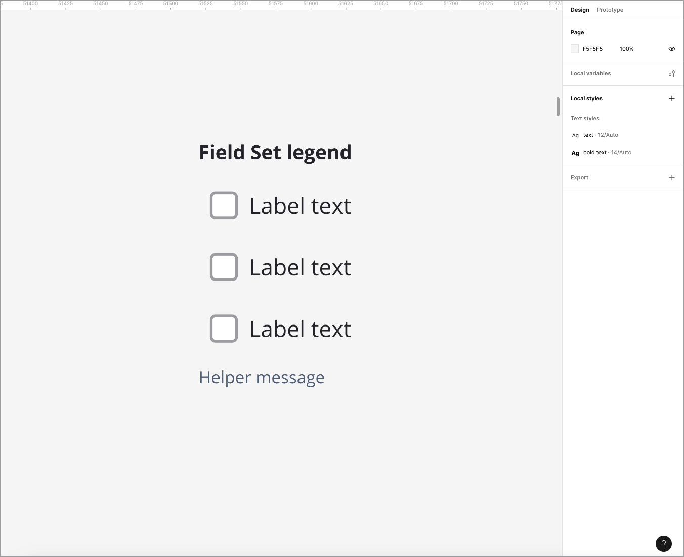
Input demos
Among several components crafted were the Field Sets and Form Fields. These two particularly stood out as game-changers in our library, leading to a significant reduction in the number of existing components. I’ve included a demo that highlights the functionality improvements enabled by this rebuild.
Field Sets After
Form Fields After
