What’s the Problem?
Agents interested in participating in the new Flex program at Zillow were faced with a complex and time-consuming signup process. This task required agents to verify their brokerages, along with various other validations, to enter the program. The data needed for validation was scattered across different teams at Zillow, each designing their own part of the experience in isolation. This disjointed approach resulted in an exceedingly difficult and lengthy signup process that needed an overhaul.
Goal
This project aimed at simplifying the Flex program sign-up process by:
- Crafting a user-friendly and seamless experience for agents to register for the Flex program.
- Enabling brokers to confirm their program participation effortlessly.
- Reducing the amount of external touch-points required for agents to complete their onboarding.
Work done
As the design lead on the project, I oversaw the entire product design cycle for the new sign-up feature. My responsibilities included creating wireframes, flows, prototypes, high-fidelity screens, assisting engineering during implementation, coordinating with product management, and liaising with QA to ensure design quality and product functionality met our expectations.
In order to provide a comprehensive understanding of the users’ journey, I developed user journey maps. This exercise required deep-diving into research findings to understand both the pain points in the current flow and the technical limitations. My close partnership with product and engineering was instrumental in this process.
Instead of just one, I had the privilege to collaborate with various engineering teams for this project due to the complexity of integrating multiple separate workflows into a single streamlined process.
Finally, together with the design systems team, we expanded the existing Wizard component to include a fullscreen version, enhancing the sign-up form’s usability.
Outcome
The project gave birth to a single, seamless sign-up flow addressing most technical and logistical requirements, significantly improving the overall user experience. The sign-up process underwent an incredible transformation, reducing from a lengthy 5-7 days to a swift 5-10 minutes.
Not only was this project successful from a user experience standpoint, evidence by increased participation in the program, but it also helped me establish a strong rapport with product and engineering partners—an achievement that aided in future collaborations.
Where it all started
I started by visualizing the flow, capturing the tasks to be completed at each stage. We were not only trying to solve for agents registering, but for brokers enrolling their brokerages into the program too. Each user had different tasks to complete, so understanding the requirements of each was essential. This particular artifact was more for myself than any other members of the team – I needed to wrap my brain around the problem space and this form of visualization helped me do that.
A modal just won’t do
Right from the get go, it was evident to me that this feature required a dedicated space. I firmly believed that a dedicated page was necessary to host the full spectrum of the user experience. Our existing Wizard component, designed to exist only within a modal, posed a challenge. To overcome this, I partnered with the design systems team, expanding the component’s functionality to support a standalone, fullscreen experience – a crucial element to complete the picture.
It’s wire-time
After understanding the problem space, I started to take the visualization to the next stage by designing some wireframes. During this phase I was exploring lots of iterations and playing with all the potential solutions I could think of at the time. Having several rounds of review with engineers to scope feasibility, the product manager to ensure that I was hitting the mark from a feature perspective, and my design team to call out any potential usability traps, I moved to flushing out the visuals.
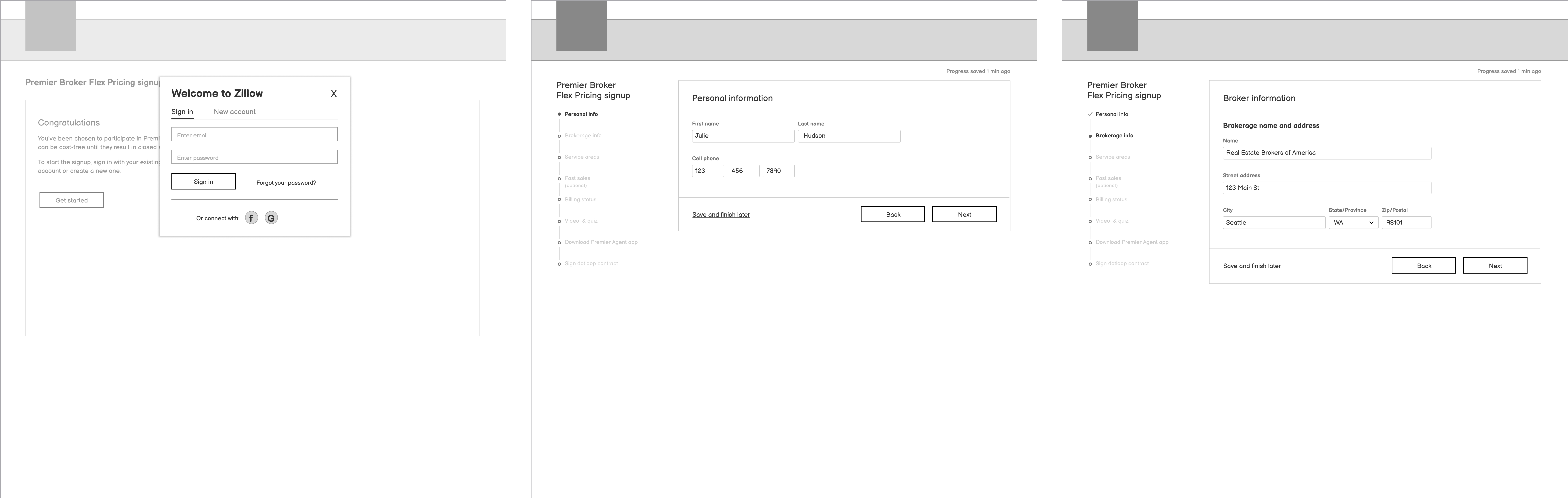
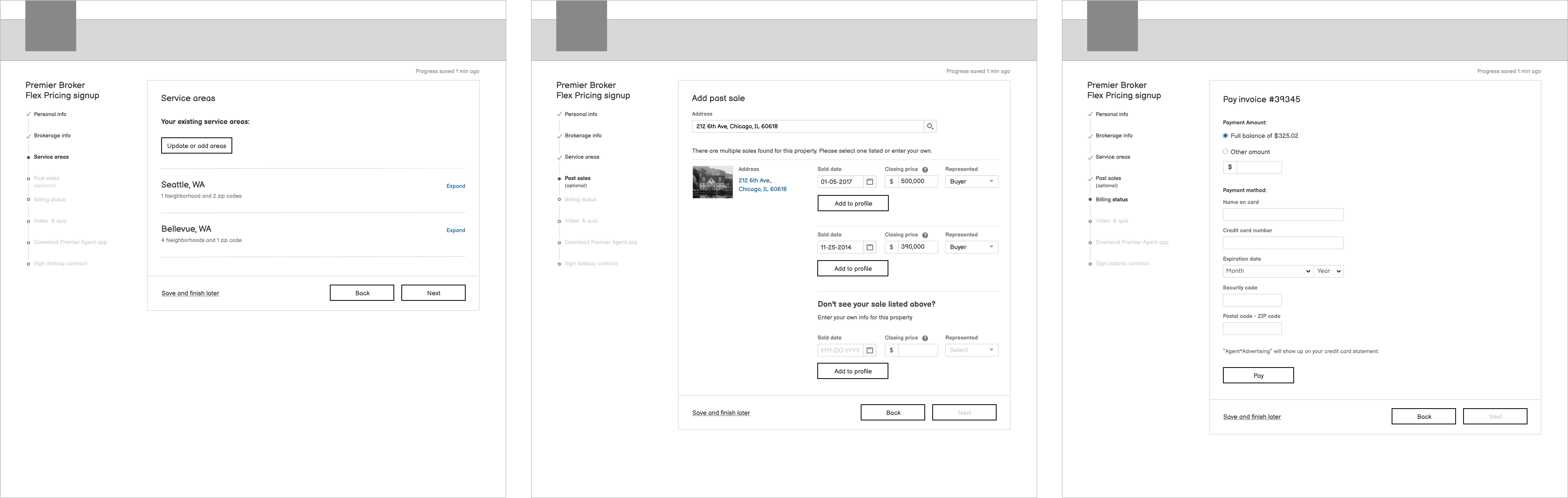
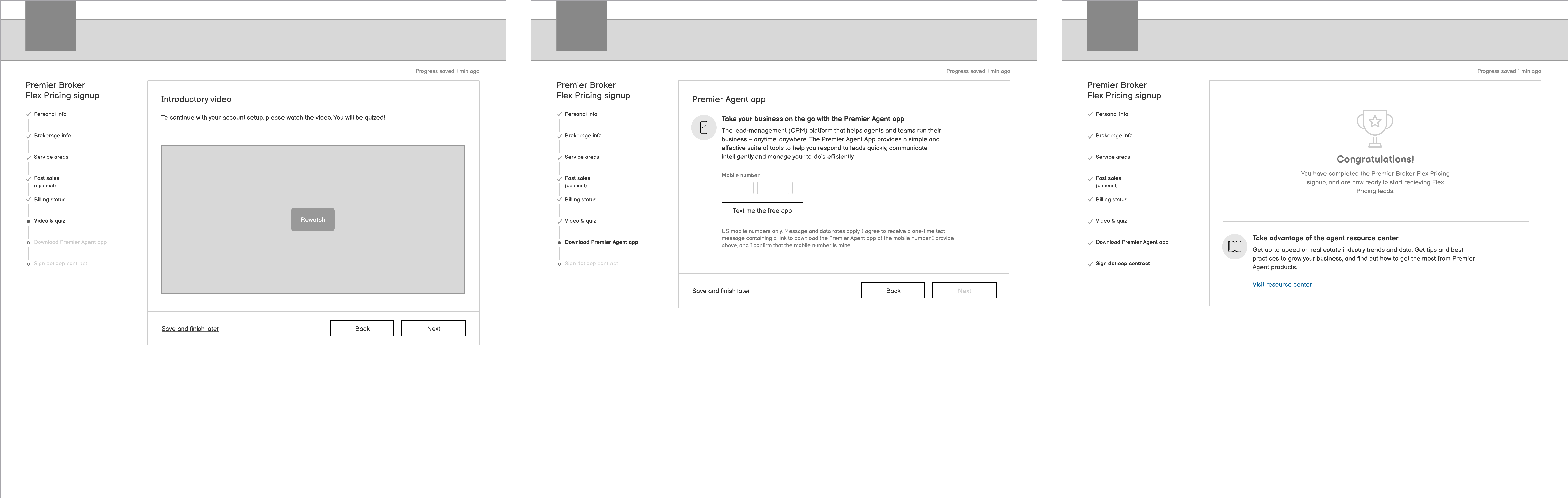
Make it look good
Just a few screens, of the more than 100+ (not hyperbole), showing some final designs. The journey to this point was far from easy. The project had to swerve multiple times, adapting to technical constraints and changing timeframes. Catering to the numerous user edge cases within both the agent and broker experience was nothing short of a monumental task.
Handoff assit
As I prepared to transition designs to engineering, I ensured each screen was visually represented and broken down into manageable sections, corresponding to specific parts of the flow. I meticulously mapped out the interactions, making the designs as comprehensive and easy-to-understand as possible. Along with the flows, I created mini prototypes to help aid as well.
If at first you don’t succeed…
Just demonstrating a few of the pivots that occurred during the project. A major one being removing the video functionality from the stepped flow and having it be a persistent item accessible at any point during the process. We had a strict limit of how many items could be in the side navigation, so pulling this from the stepped flow in order to accommodate a new step called “Past Sales” was necessary.
Another significant pivot was the final step of the flow, the confirmation of successfully signing up. During a design review with my peers, they called out that it was hard to tell what the agent needed to do in the event that the signup was incomplete. I agreed and took another stab, really breaking out the different items that needed attention. I feel like the updates made a huge improvement to the comprehension of this page ensuring that agents knew what to do next.
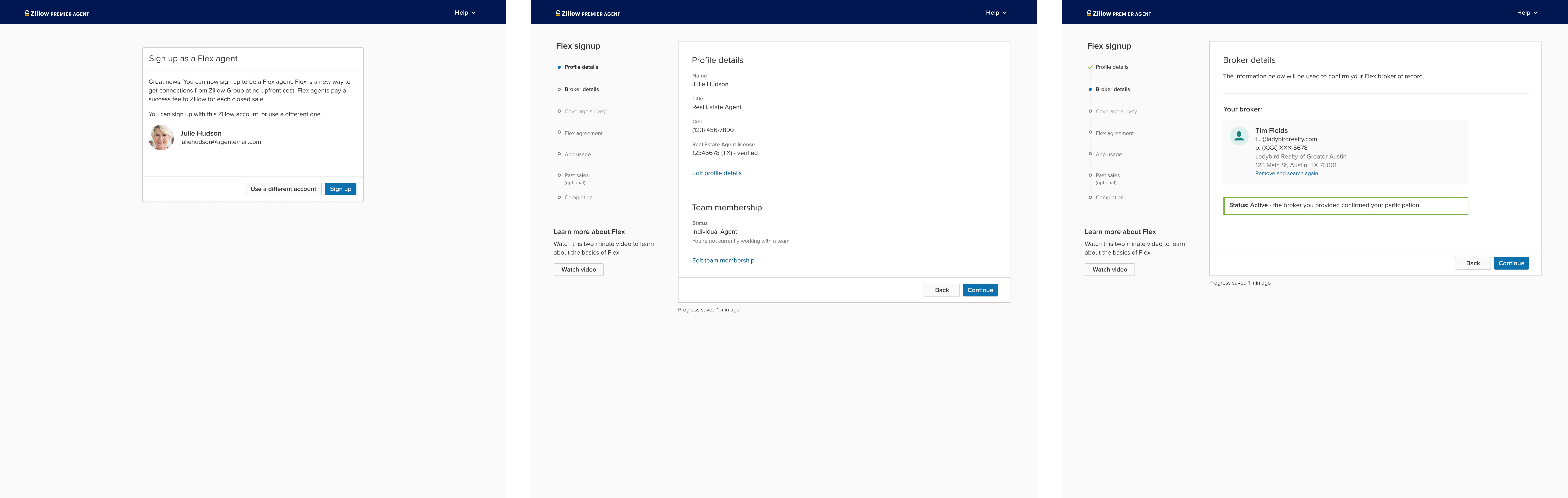
Broker experience
While the signup process was comparatively straightforward for brokers compared to agents, brokers had an additional layer of complexity – managing agent participation in the program. They needed a way to approve agent requests and authorize their participation. They also needed the ability to remove agents if they left their brokerage. To handle these requirements, I was tasked with designing “Your Flex Agents,” a dedicated page for brokers to manage agent participation effectively and conveniently.