These mocks display my design process for Amazon’s advertising product/app ‘Recipes’ based around our grocery clients, and Amazon’s desire to do more to connect customer’s digital experiences to their kitchens, while also generating ad revenue. The end goal is to ultimately enable customers the ability to read recipes, watch step-by-step videos, save recipes, as well as receive special offers to purchase key ingredients through Amazon and the emerging Amazon Fresh service. Due to timing of launch and developer resources, several features had to be omitted from the initial release. The idea is that the app will continuously be reiterated on, and will eventually contain all these features.
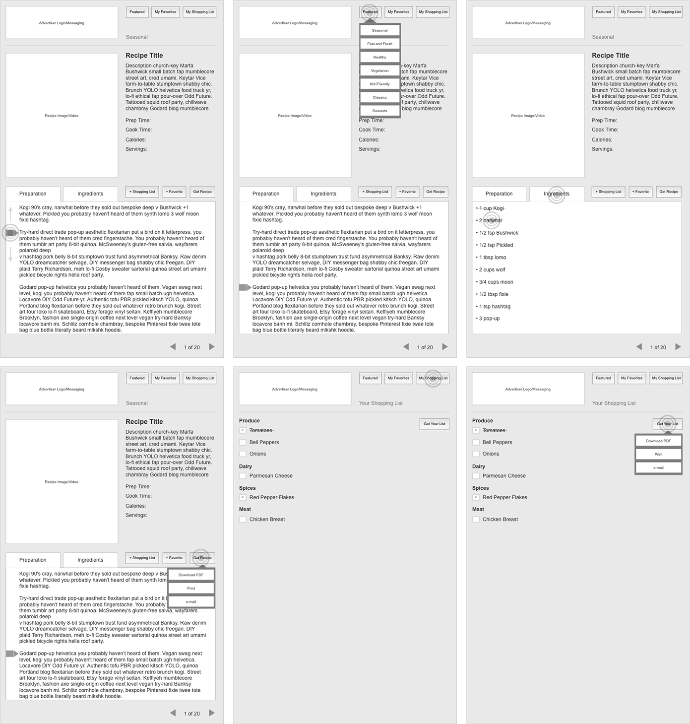
Round 1 – Go Big

Wishlist of features and functionality.
1 of 4
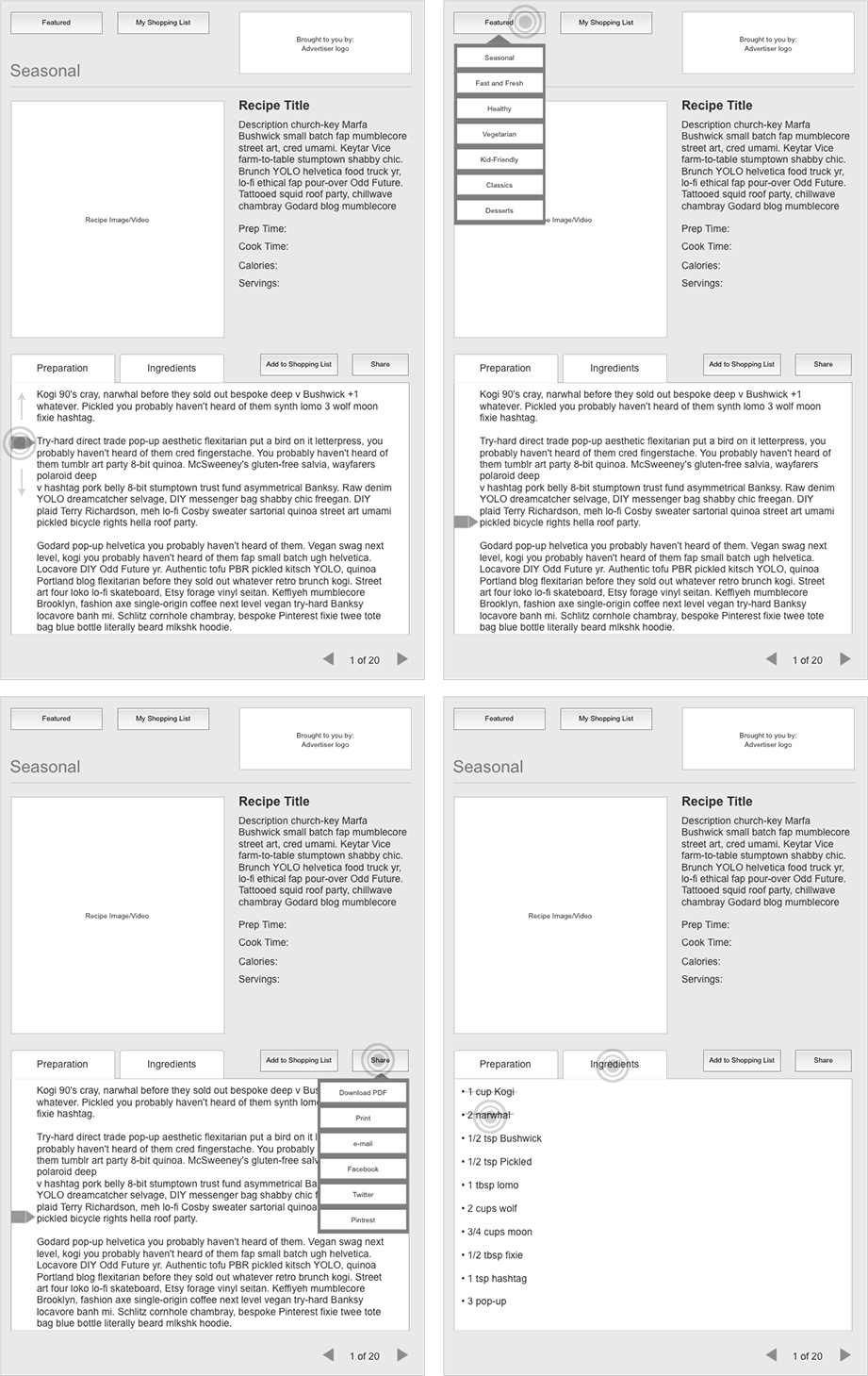
Round 2 – Narrow Down Features

Whittle down features to more realistically align to product launch date.
2 of 4
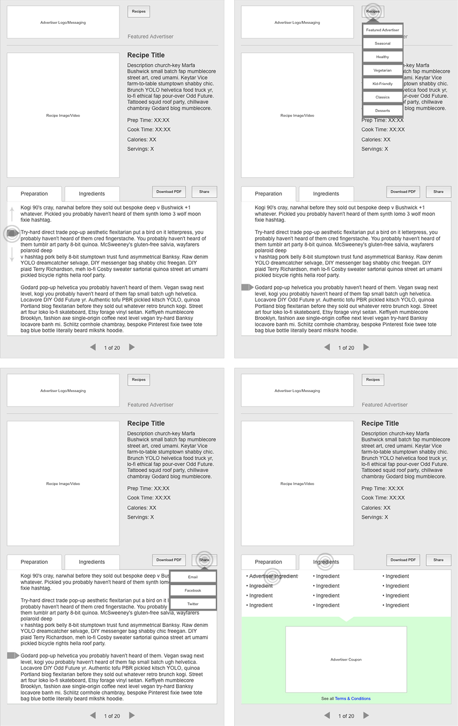
Round 3 – Realistic Launch Features to Developer Resources

Narrow down features even further to coincide with Developer resources and product launch date.
3 of 4
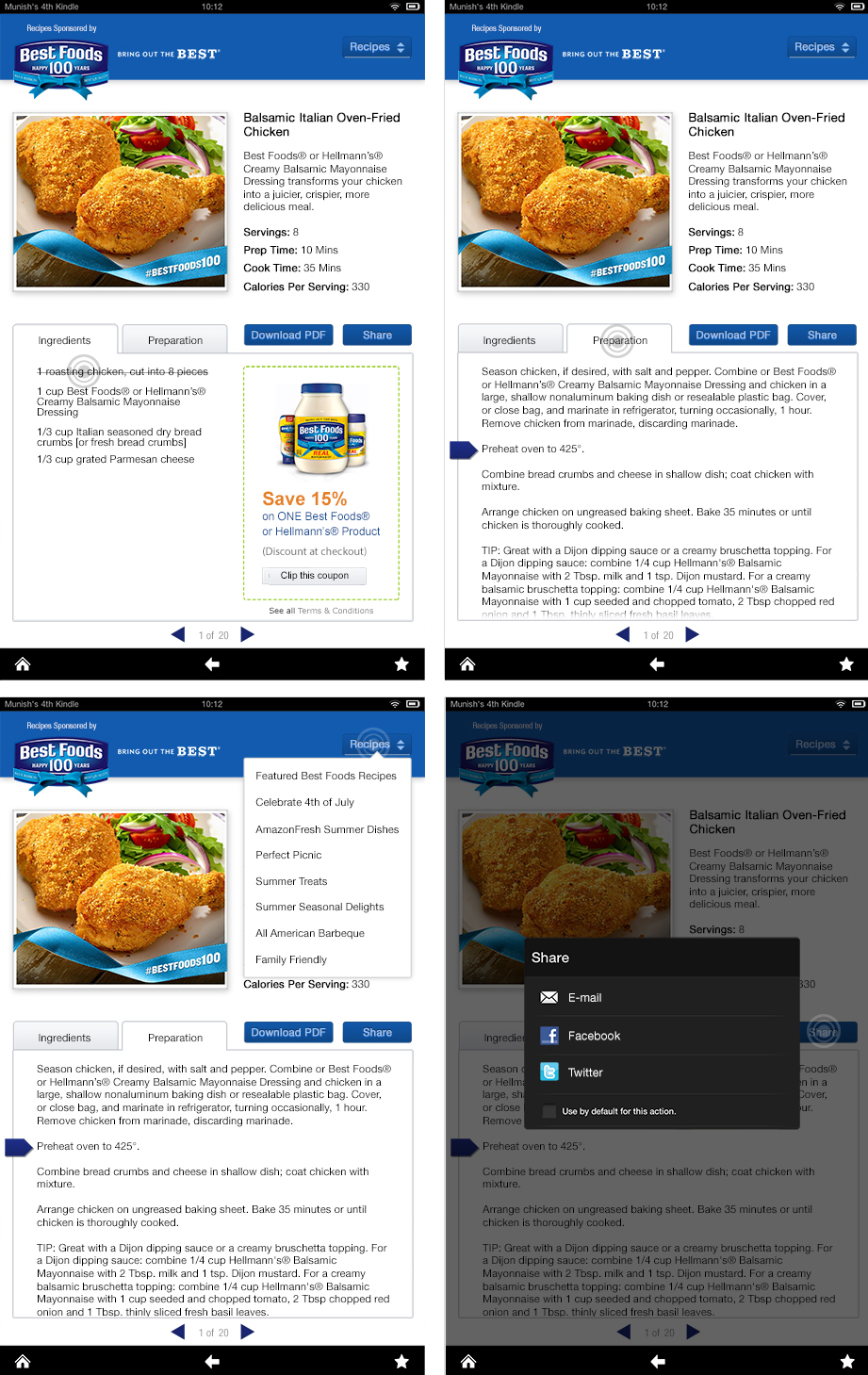
Round 4 – Make It Look Good

Last version with minor tweaks made to round 3 wireframes. Incorporate Kindle Fire Amazon UI elements to keep on brand with Amazon experience.
4 of 4
