What’s the Problem?
The Contact List feature within Premier Agent was in urgent need of a redesign. The feature trailed both in functionality and integration, especially bound by the lack of a dedicated Contact Detail page (which I was also lead designer on eventually crafting).
Goal
The key objectives of this project were to:
- Provide customized contact information based on the type of Agent using Premier Agent (e.g., team lead, agent, lone wolf, etc).
- Incorporate the new Contact Detail Page’s functionality into the Contact List.
- Update the experience to utilize PAXL and the new Premier Agent branding.
- Enhance filtering capabilities.
Work done
As the design lead, I carried out the following tasks:
- Identifying the need for the project and ensuring it was included in the product’s roadmap.
- Carrying out a competitive analysis to establish standards and stimulate fresh ideas for the redesign.
- Managing the entire product design cycle including creating flows, prototypes, preparing high-fidelity screens, coordinating with engineers for implementation, and working with the product management for scoping the effort.
- Collaboratively working with the QA team to assure the quality of design and the expected product functionality.
Outcome
The redesign of the Contact List was crucial to enhance the page’s capabilities. With the addition of new filtering options, agents were now able to narrow down their list and identify key contacts requiring touch-points more efficiently. By removing the contact detail section and redirecting to the dedicated contact detail page, we were able to free up space to surface more vital information in the Contact List.
By adopting PAXL, not only did the functional aspect improve, but the overall look and feel of the page also received a facelift, improving the overall user experience significantly.
This project exhibits the transformative power of design in enhancing functionality, improving user experience, and ultimately, driving productivity.
Where it all started
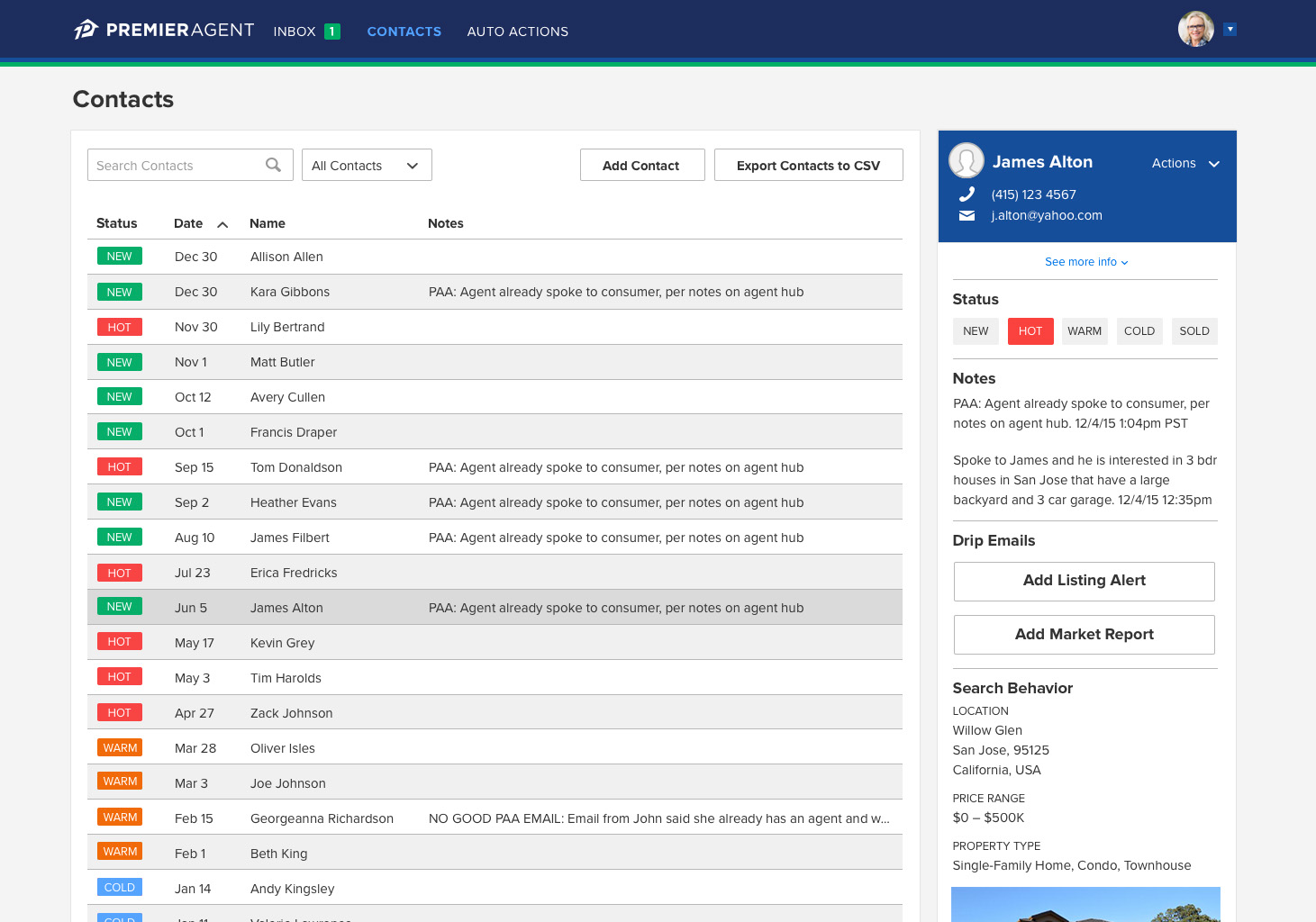
Evolving the Contact List happened slowly over time. This was the state before I started the project. The list was relatively sparse on rich content, as a considerable portion of the detailed information was housed in the contact panel situated to the right – an element I advocated for removing…stay tuned.
Baby steps
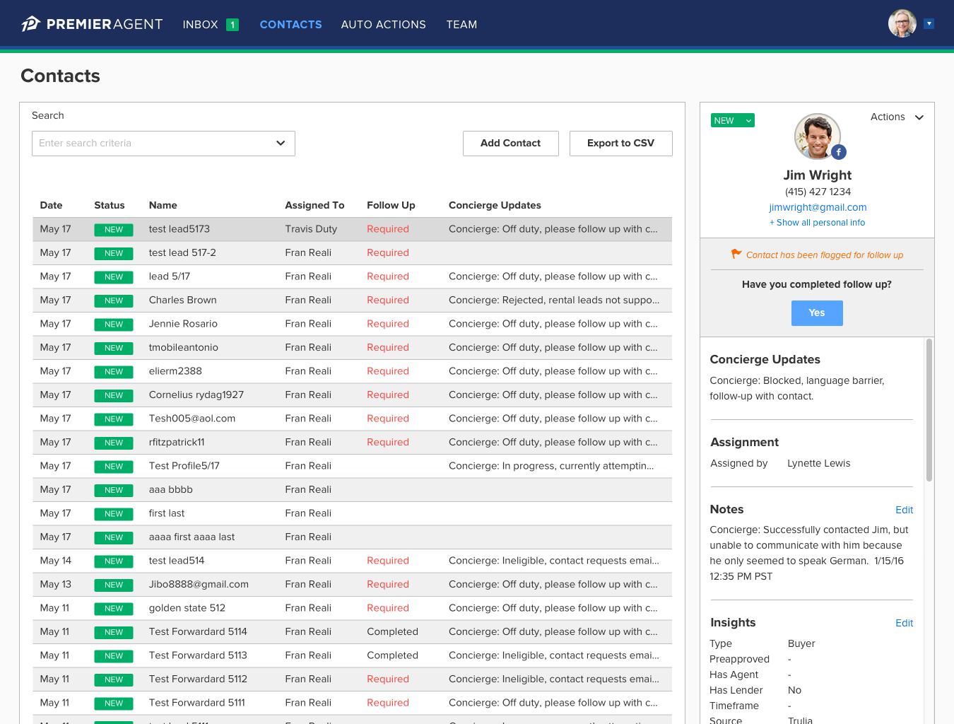
In this revised layout, I was successful in incorporating more information directly into the list, enhancing its value. The contact panel is still there, but its appearance has been improved, a project which I also owned.
Slowly, but surely
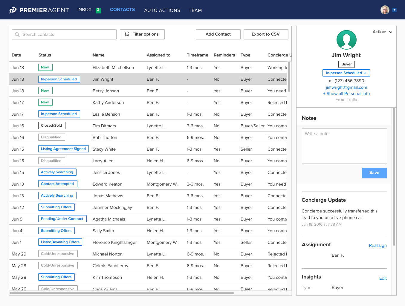
Finally starting to make some impact on the list visually, incorporating redesigned tags, but horizontal scroll – no good. Also continued to iterate on the contact panel because product was not onboard to remove it just yet (Some background here, at the time, we did not have a dedicated contact detail page, so any information about a contact was stuffed into that panel. It couldn’t be removed until we could create a dedicated page to house the content – an initiative I had been long advocating for…but that’s another story).
A girl can dream
While product was not yet onboard for removing the contact panel, I did do some explorations of how we might change the page to still accommodate the info, but not have it take up so much of the page unless an agent opted to see more info. The contact list was intended to be a way for agents to quickly find and access their leads, not necessarily read a book about them.
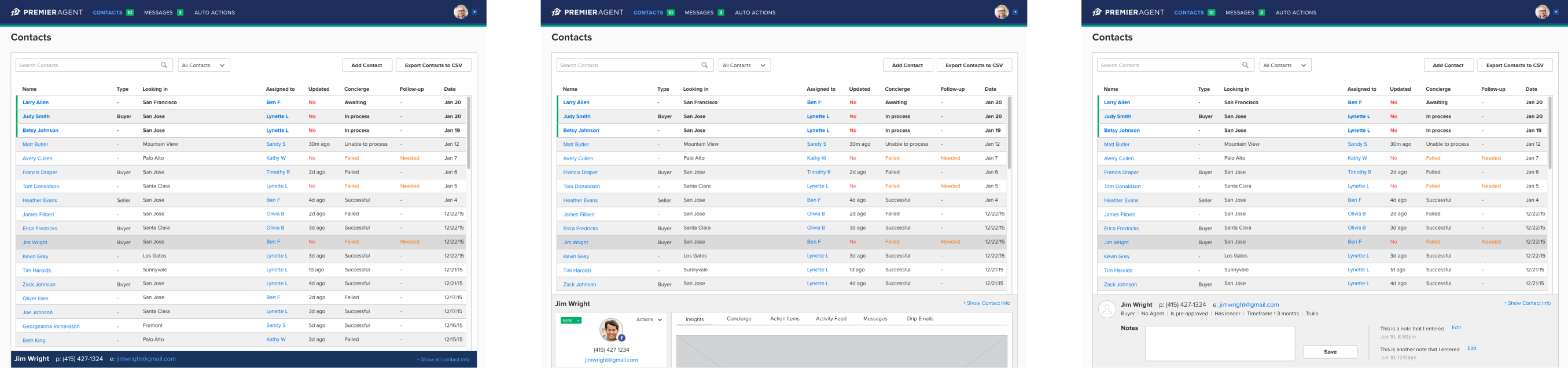
A wish comes true
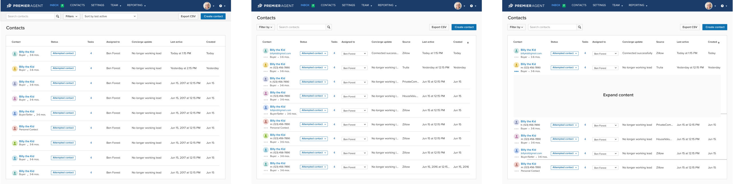
Finally, after over a year, I was able to really make this the feature I always knew it could be. Not only was the contact panel finally removed (the dedicated contact detail page I designed was launched – another huge win), I was also able to give the page a much needed facelift utilizing our new PAXL design system.
Previous iterations
Just a couple of screens to show some of the explorations I played with – putting the actions inside a fixed bar under the nav, and some potentially expandable content triggered by a button under a contact’s avatar.